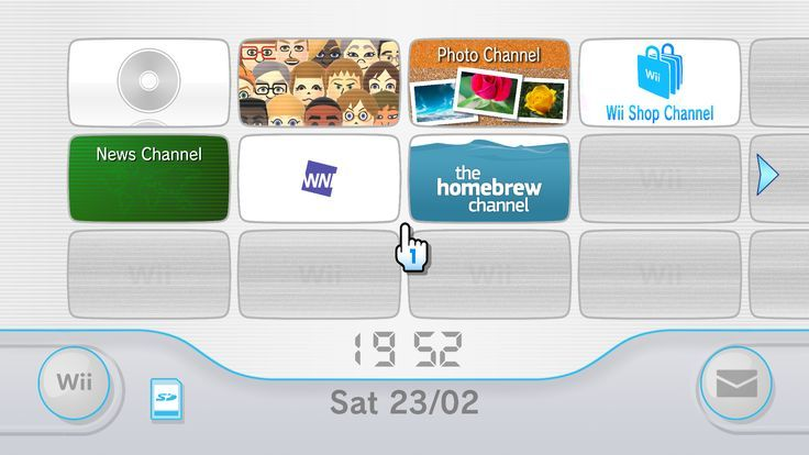
Making This Blog
Intro, what I wanted
I have many passions in life and I wanted some kind of personal journal to start talking about them. Since it's mine and no one tells what to do, I wanted to an unusual UI, one that feels nostalgic and practical.
The UI choice and design
Rant about top navbar
I feel like the classical top navbar is overused and I don't really see why we would make the navigation so soulless and take such a small portion of the screen. Compared to a proper menu page, it does not even prevent a reload, modern web framework can handle that fine. It works fine, I just feel like we could do something more fun sometimes.
Video games (and by extension consoles) are meant to be fun, make you want to explore, stay,... You don't see a top navbar used often there.
Why the WII?
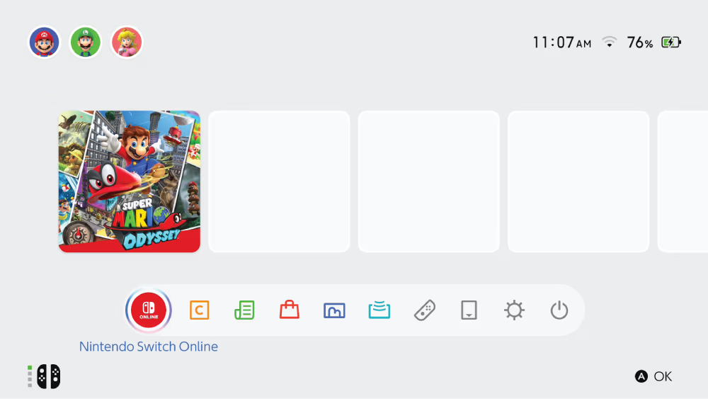
So I took direct inspiration from a console's menu but not any. Most consoles are designed around joystick or arrow inputs. And most of them have a 1-dimension menu (like the game choosing screen bellow).
The WII is special because it was meant to be controlled with some kind of pointer. That's already much closer to a mouse, better yet, a terrible mouse. And in my opinion they still managed to make their menu accessible and satisfying. And so I tried with this website to replicate that feeling (I hope I won't get a lawsuit from nintendo).
The structure / architecture
I wanted something very extendable yet very simple conceptually.
Structurally we have 2 elements: posts and channels. A channel is nothing more than a playlist of posts.
Each entry in the menu (home page) is either a post or a channel.
(WIP)